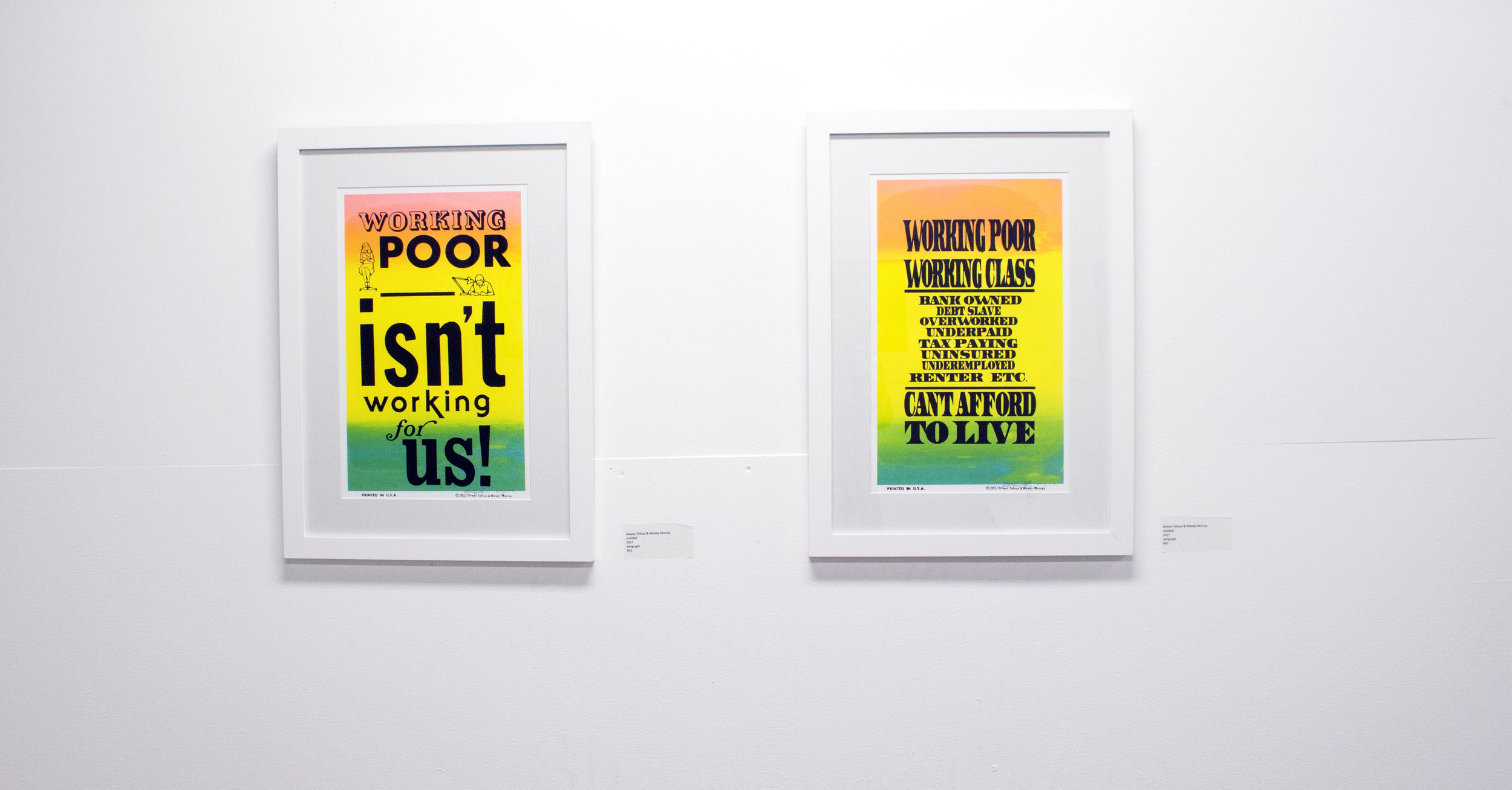
Working Poor
“untitled”
11x14, serigraph
NFS | Dewey Tafoya & Wendy Murray, 2017.
The Collaboration
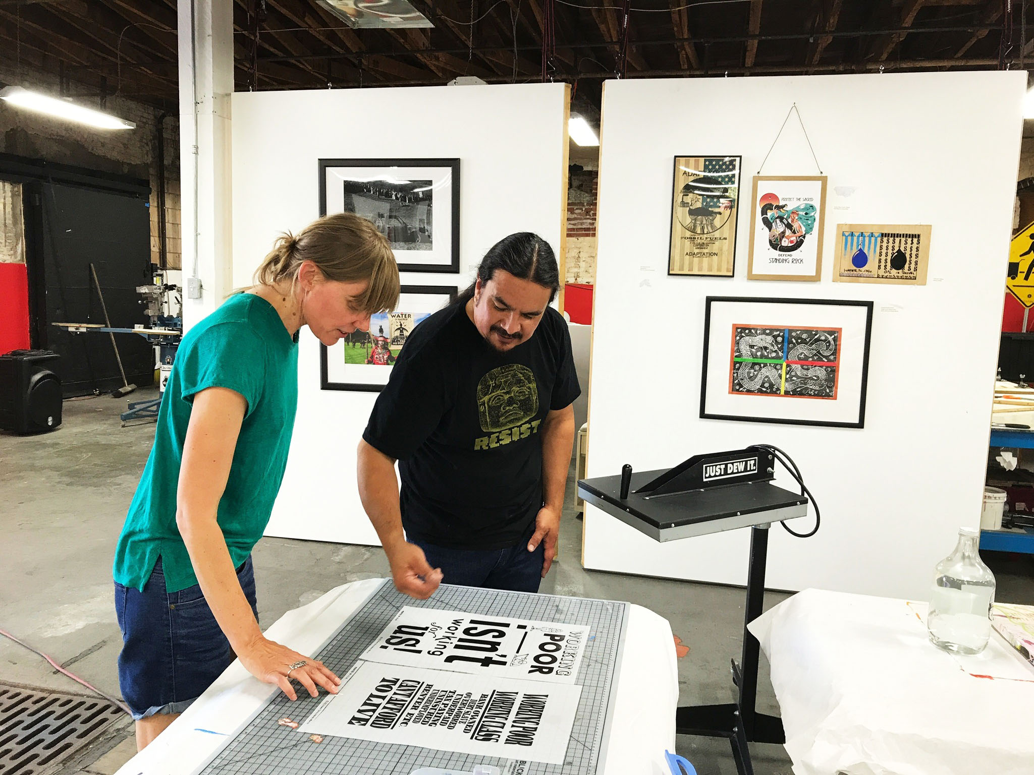
Earlier this summer, Wendy Murray, an artist from Australia, stopped by our studio hoping to make a print. Murray first heard about Self Help Graphics & Art from printmakers back home. She is the first artist from Australia to visit our studio since the 1980s. When she first arrived to our space she was instantly introduced to Dewey Tafoya. The pair sat down and had an open discussion about their lives. They talked about everything from job insecurity to high rents to their art practices. The parallel in their lives inspired the subject of their collaboration- the working poor class.
Working poor is a term more used more popularly in the United States than in Australia. Working poor is used to describe any individual who spends 27 weeks or more either looking for work or working but whose income falls below the poverty level.
The Process
Moving forward with the collaboration it was extremely important that the design and message of the posters be concise, smart and straightforward. It needed to be relevant and applicable to the lives of everyday people.
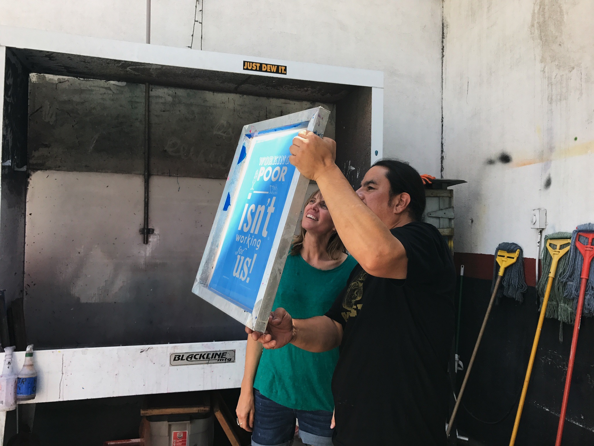
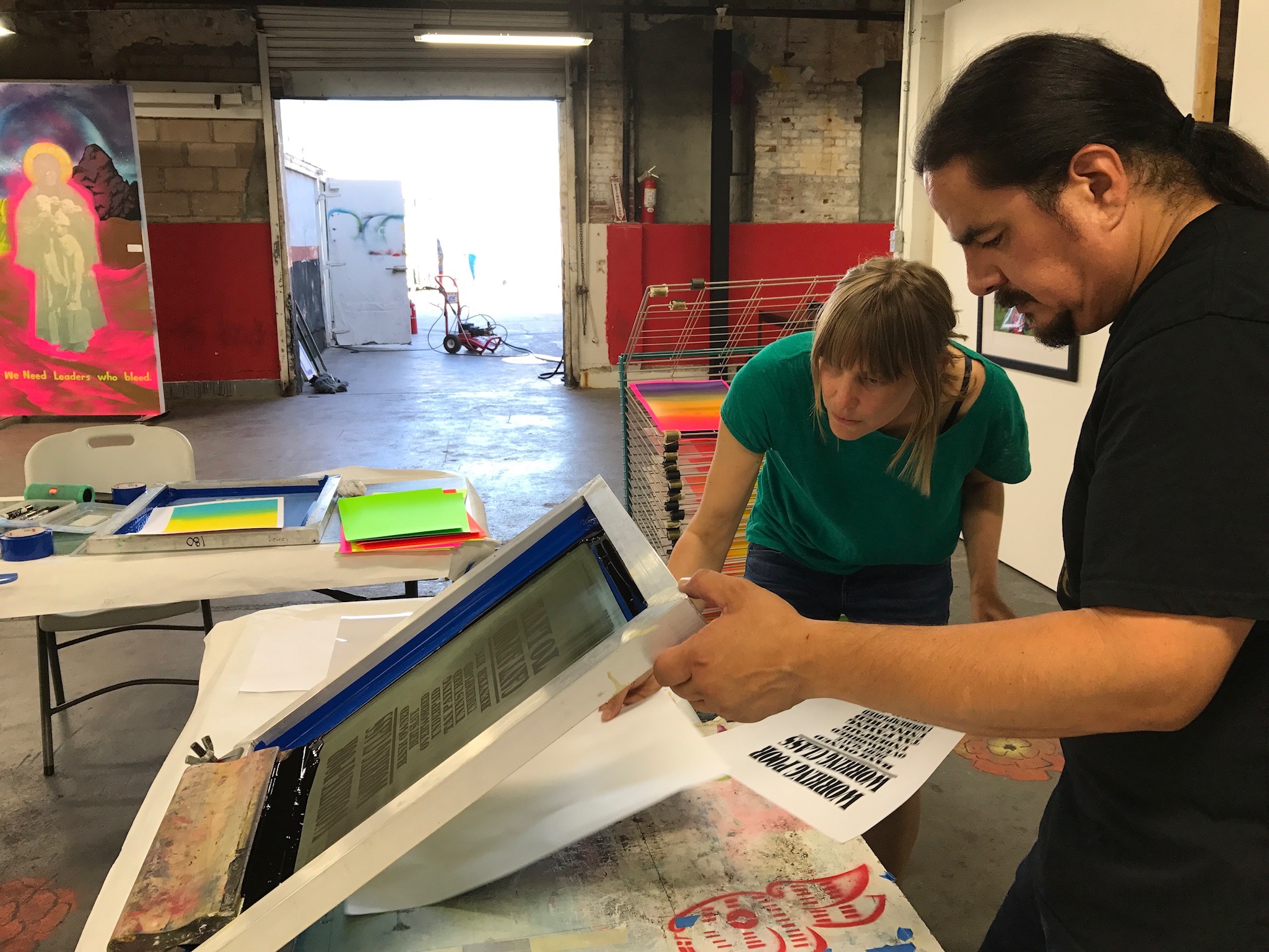
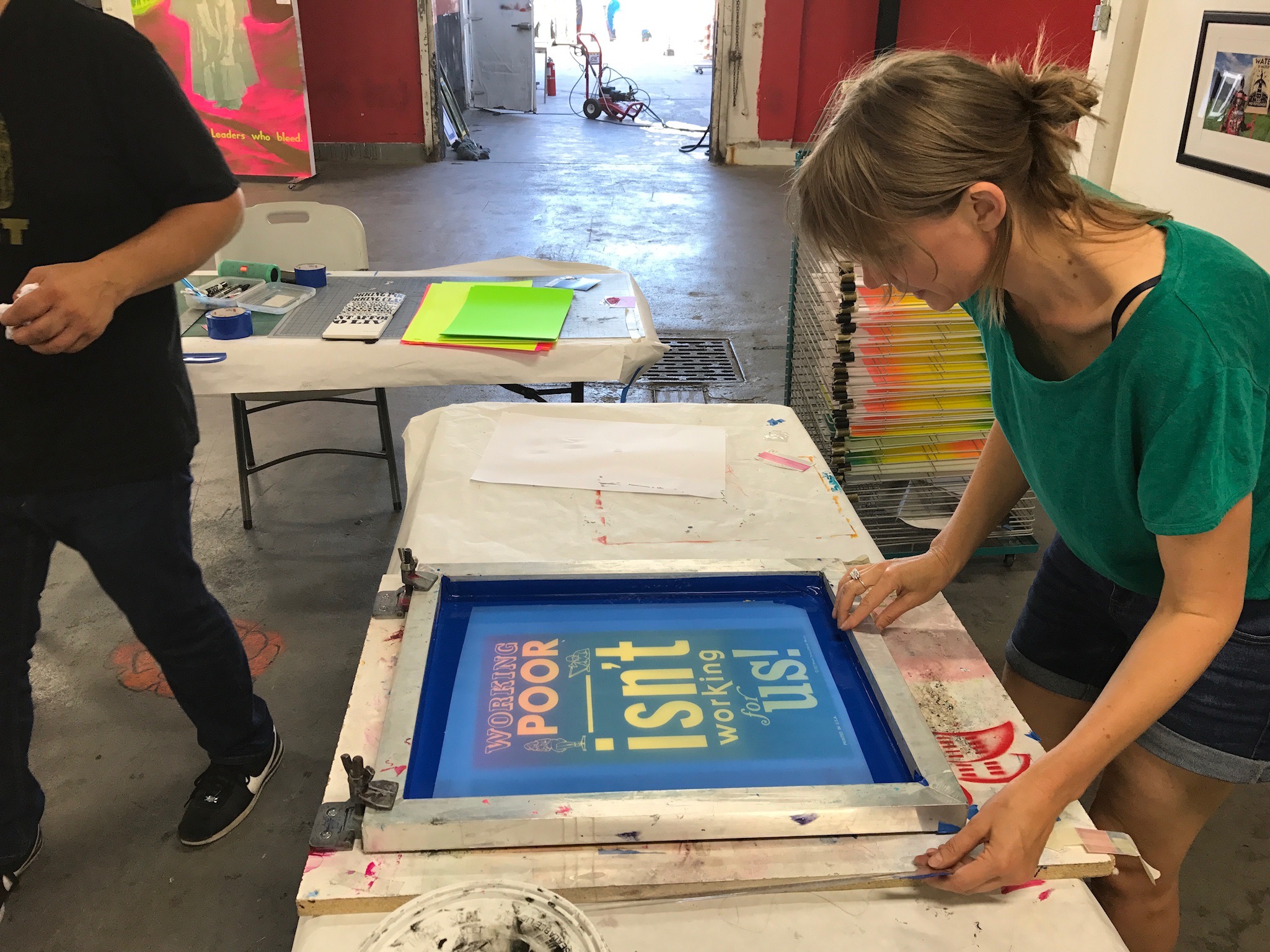
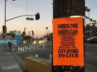
The collaboration was a merge of two different processes. Murray’s process is strongly informed by old printmaking books and archive posters. Recently, the artist has only been using Letraset typography, tone, and clip art. Letraset provides immediate negatives and leaves room for mistakes. Murray believes these mistakes allow for the feel of the artist’s hand to come through. Tafoya is often able to hand draw a design instantly. In this case, he was able to design something on Photoshop that spoke to having to pay taxes and the burden that puts on the Working Poor.
An Homage to Colby Poster Co.
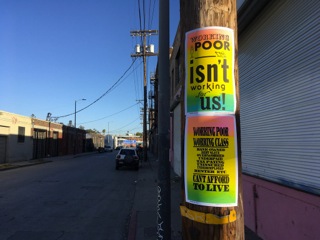
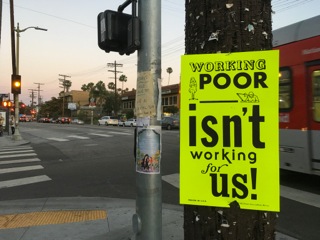
The posters were a way to acknowledge the history of the pole poster in Los Angeles and play to Tafoya’s strength. He often uses the split fountain technique during his workshops and Murray wanted to bring this element into the collaboration. For Murray, the bright fluorescent paper and black typography created a mixture of a Colby poster and a garage poster. The split fountain and black typography posters were a direct nod to the Colby tradition and Los Angeles street aesthetic. The homage was a way to keep true to an art form and technique that changed printmaking forever.
The Final Product
Dewey Tafoya is a visual artist and screen printer whose work is influenced by urban landscapes, culture, and communities of inner city LA. Tafoya's work tends to deconstruct historical narratives and reconstruct them with the perspective of the oppressed or the under represented. To view more of his work visit his Instagram page @deweytafoya.
Wendy Murray is a Sydney-based artist and arts educator. Her work is informed by street art, graffiti, and her interest in pyscho-geography and the unplanned journey. She currently lectures in Printmedia at Sydney College of the Arts. To view more of her work visit wendymurray.com.au.
Arleny Vargas is a Boyle Heights-bred resident. She’s currently an undergraduate student at Wellesley College pursuing her degree in Spanish and Studio Art. Passionate about art and representation, she seeks to combine her writing and art in an effort to combat negative media representation and amplify the narratives and experiences of the Latinx community.

